适用于不复杂的列表场景处理
规则
Example
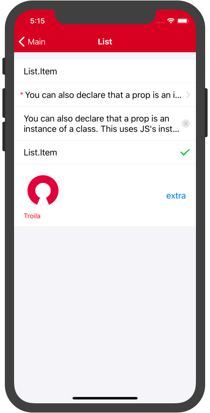
| iOS |
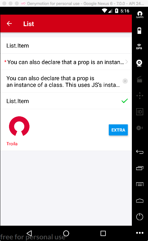
Android |
|
|
Code
import React, { Component } from 'react';
import {
    View,
    StyleSheet,
    Image,
    Button,
} from 'react-native';
import { List, Text } from 'troila-mobile-ui';

const {
    Item
} = List

export default class Example extends Component {
    render() {
        return (
            <View style={styles.container}>
                <List>
                    <Item>List.Item</Item>
                    <Item
                        required={true}
                        numberOfLines={1}
                        extraIcon={'horizontal'}
                    >
                        You can also declare that a prop is an instance of a class. This uses JS's instanceof operator
                    </Item>
                    <Item
                        numberOfLines={2}
                        extraIcon={'close'}
                        onClose={()=>{
                            alert('this a close')
                        }}
                    >
                        You can also declare that a prop is an instance of a class. This uses JS's instanceof operator
                    </Item>
                    <Item
                        extra={
                            <Image
                                source={require('../assets/list_1.png')}
                                style={{width:20}}
                            />
                        }
                        onPress={()=>{
                            alert('onPress the item')
                        }}
                    >
                        List.Item
                    </Item>
                    <Item
                        extra={
                            <Button
                                title={'extra'}
                                onPress={()=>{}}
                            />
                        }
                        onPress={() => {
                            alert('onPress the item')
                        }}
                    >
                        <View>
                            <Image
                                source={require('../assets/list_2.png')}
                                style={{width:80,height: 80,}}
                            />
                            <Text style={{marginTop: 5,color:'red'}}>Troila</Text>
                        </View>
                    </Item>
                </List>
            </View>
        )
    }
}


const styles = StyleSheet.create({
    container: {
        flex: 1,
        backgroundColor: '#f5f5f9',
    }
})
List Props
| 属性 | 说明 | 类型 | 默认值 |
|---|
| disabled | 禁用 | Boolean | false |
| disabledOnPress | 禁用时点击事件 | Function | ()=>{} |
| style | 容器样式 | Style | null |
List.Item Props
| 属性 | 说明 | 类型 | 默认值 |
|---|
| onPress | 点击事件 | Function | ()=>{} |
| required | 是否必填 | Boolean | false |
| style | 样式 | Style | null |
| numberOfLines | 内容文本行数 | Number | 1 |
| extra | 右侧内容 | String,Element | null |
| extraIcon | 右侧icon | horizontal,close | null |
| extraTextStyle | 右侧内容为String时Text样式 | Style | null |
| onClose | 右侧icon为close时点击事件 | Function | ()=>{} |